Twisted Nose gin is the flagship product from Winchester Distillery. Launched over 5 years ago it has established a loyal audience (including the Valiant team). However, with over 500 UK gin brands and a further 6000+ worldwide, how do you convince a consumer to choose your product in this saturated market? We started some serious research (and tasting) to tackle this challenge.
Overview
Key objectives
- Reposition the Twisted Nose brand
- Create a bottle with shelf appeal
- Minimise the time required in the bottling and labelling process
- Create an instantly recognisable product
- Reduce material usage as part of a distillery sustainability push
- Ensure the key ingredient, watercress, is obvious
- Capture the provenance and heritage
- Design a bottle which looks as good as the spirit within it
- Increase sales on and off trade
- Limit breakages in transportation
Key Deliverables:
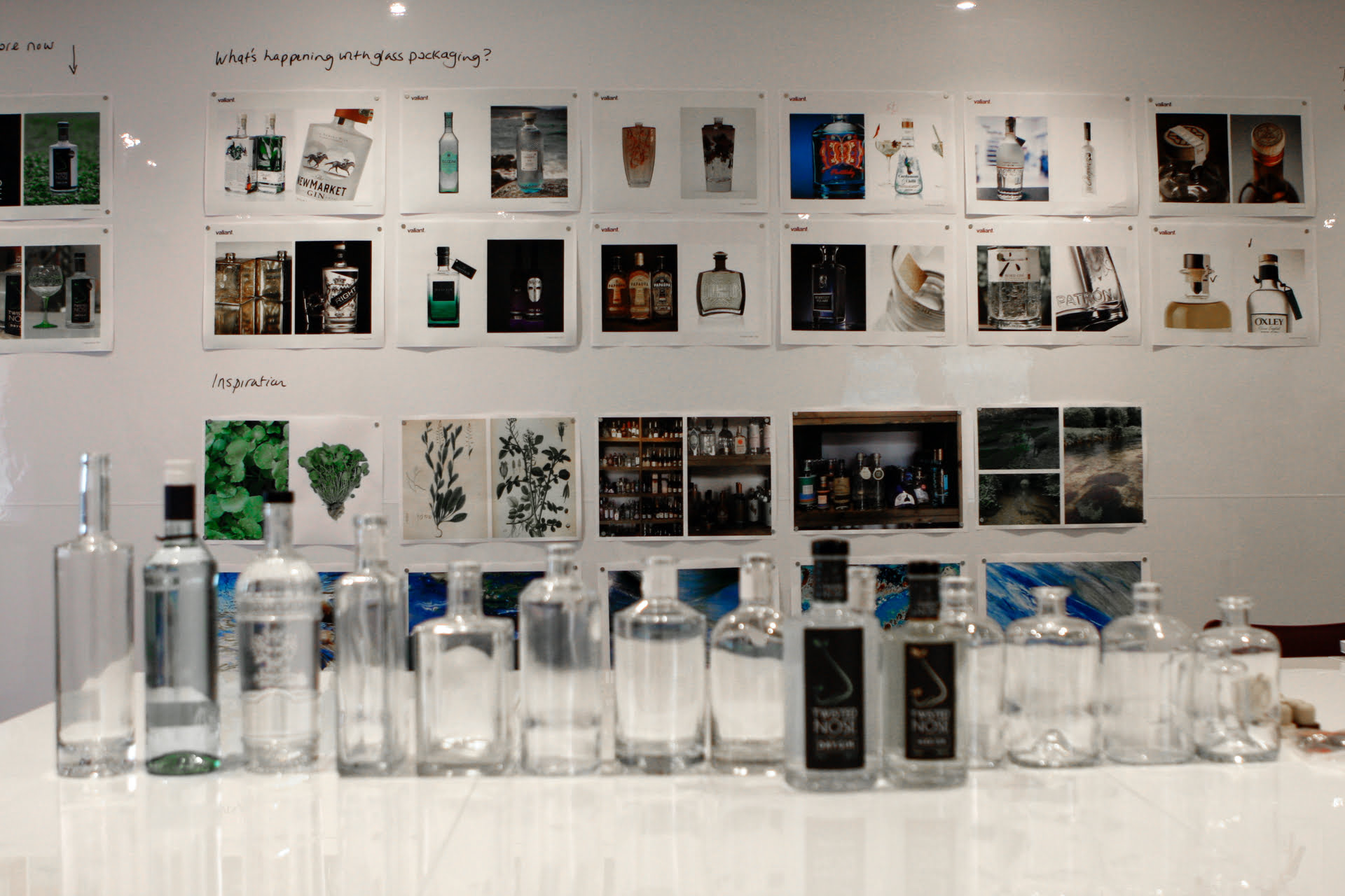
- Research
- Competitor analysis
- Brand strategy
- Brand positioning
- Values
- Key messaging
- Brand guidelines
- Brand application

Background
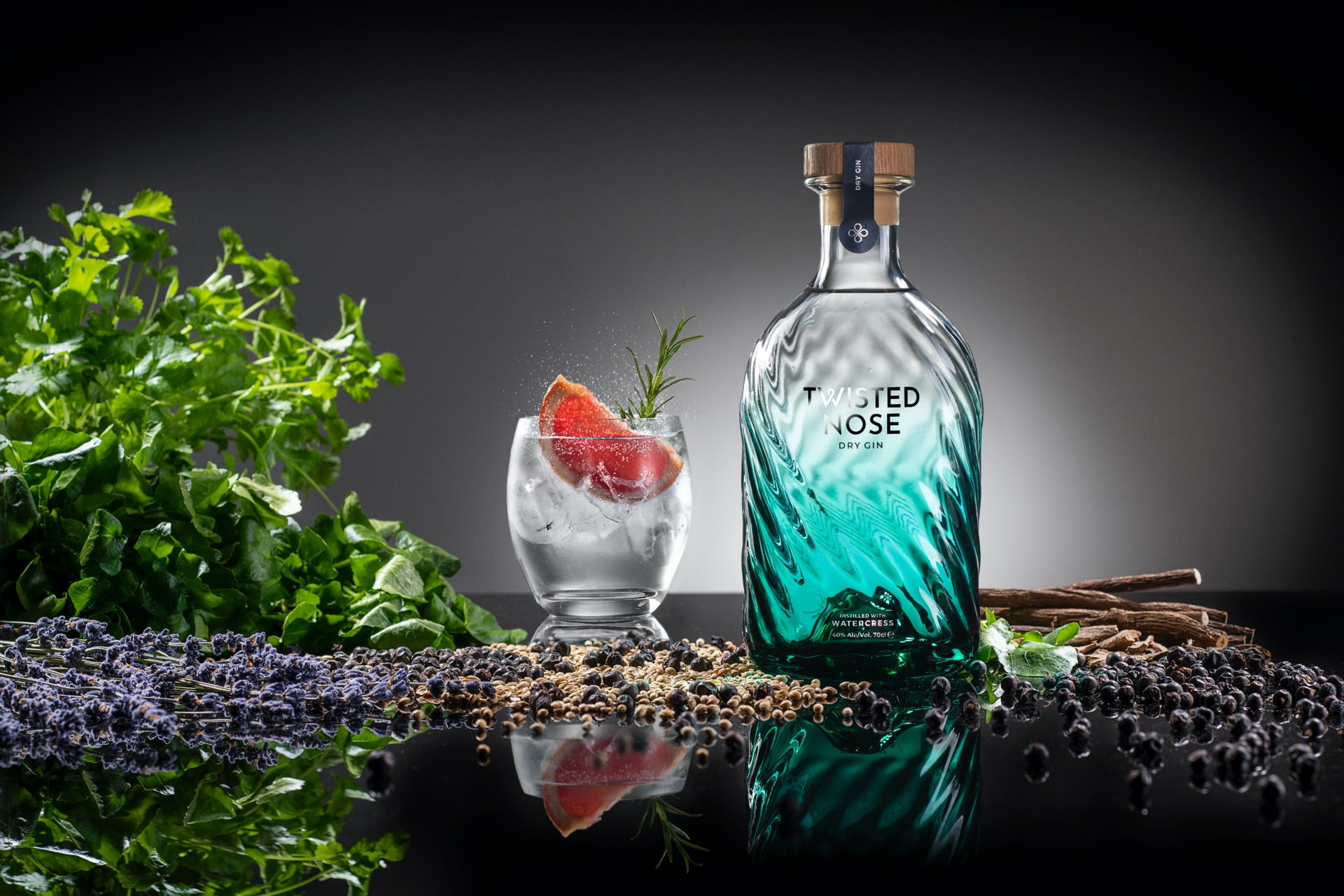
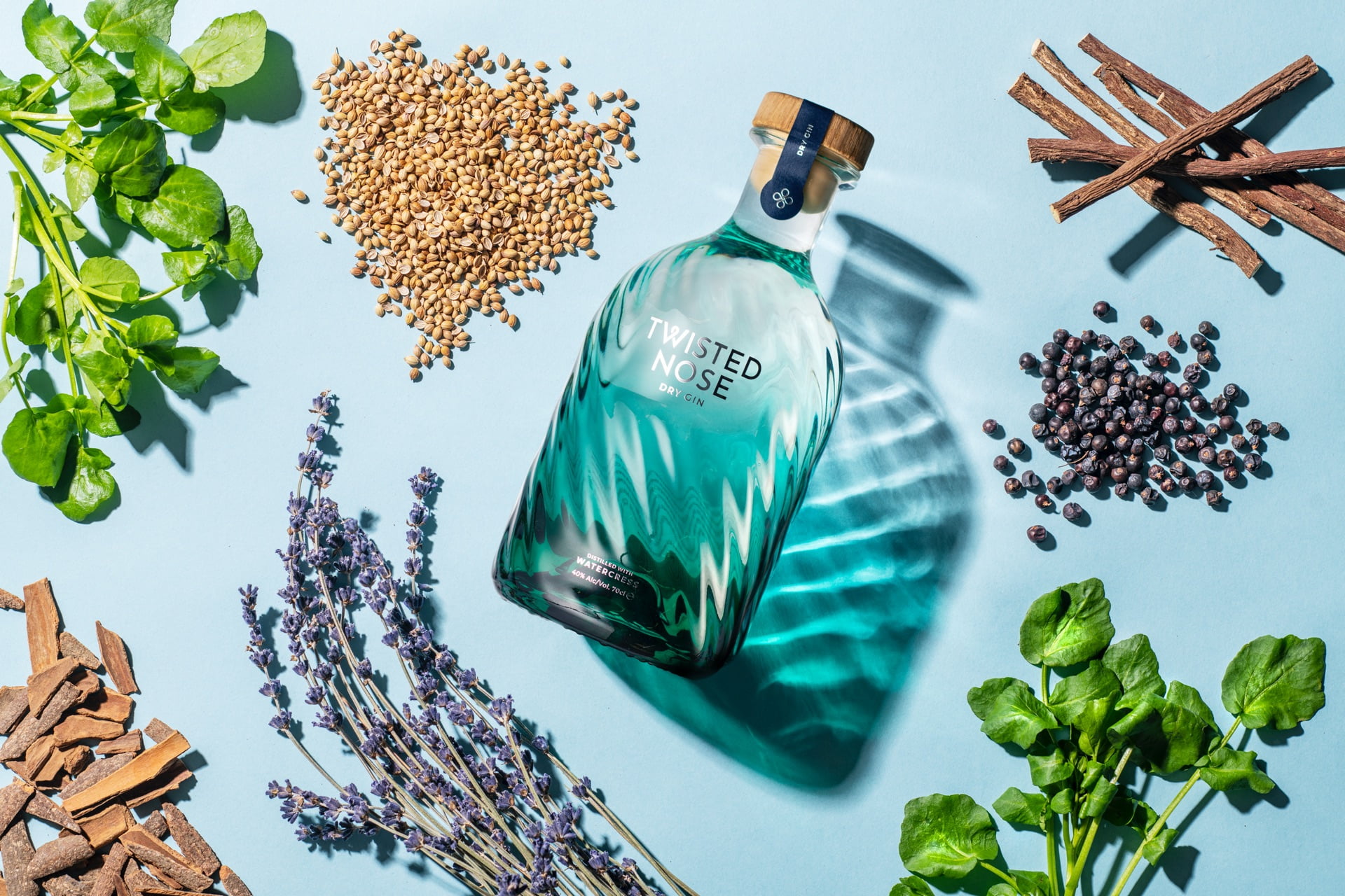
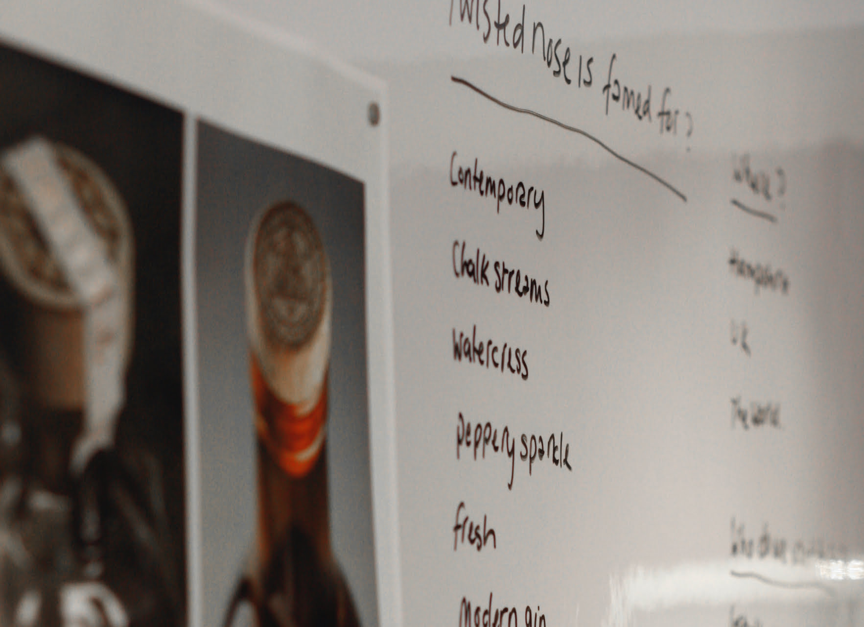
Deep in Winchester, Hampshire there is a mass of beautiful chalk streams. Around their crystal clear waters can be found many of nature’s wonders — from freshwater trout, diving kingfishers and iridescent dragon flies. When you look a little closer you can find masses of wild watercress — pure, plump and peppery. And it is that watercress which is the star of the show in Twisted Nose gin.
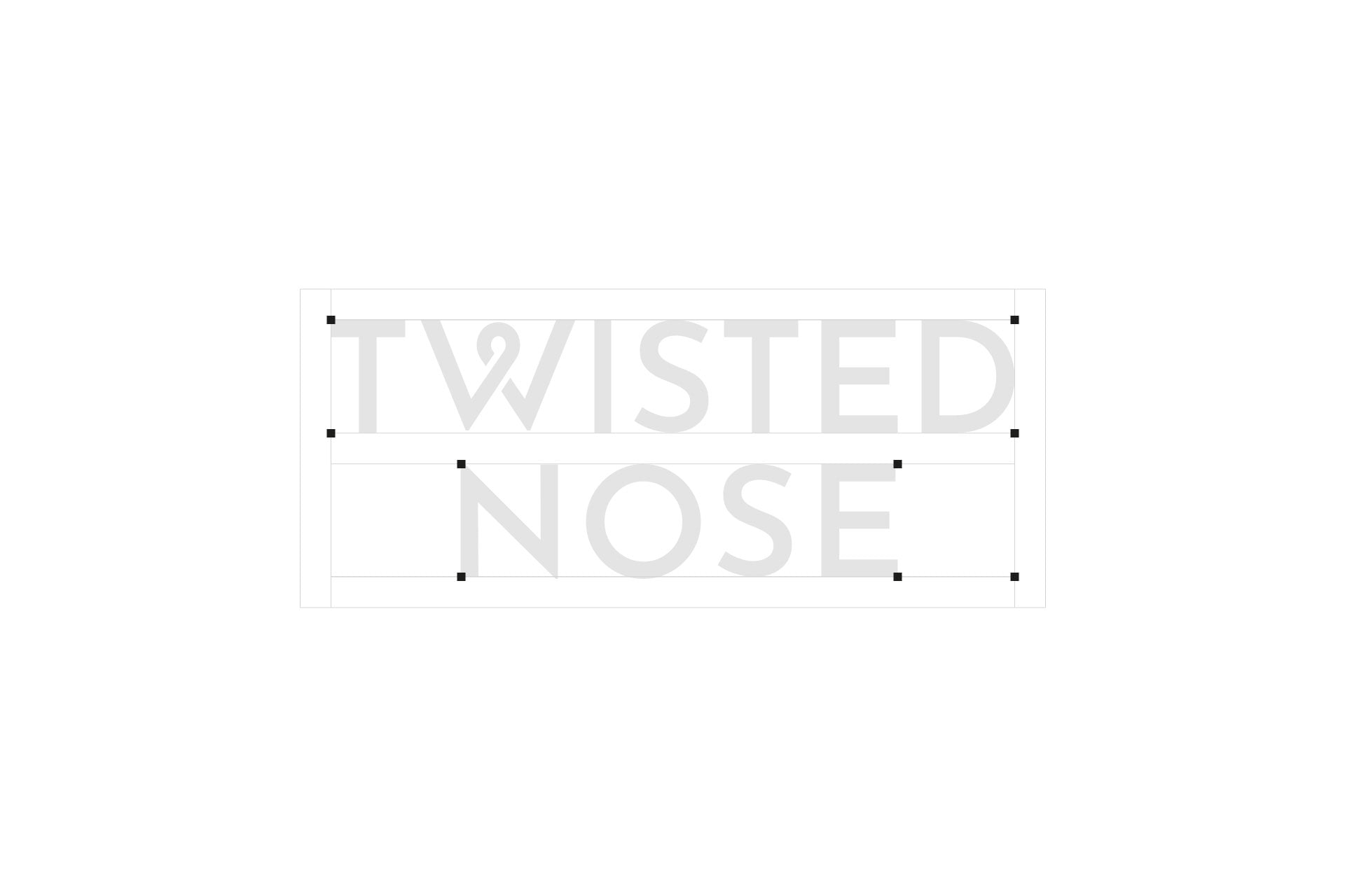
What’s in a name?
Did you know that watercress has the latin name of nasturtium and when translated literally you get Twisted Nose? Why? Well, you know how your nose wrinkles when you’re about to sneeze from something peppery? Winchester watercress is definitely peppery, hence the name. And watercress forms the key, contemporary botanical in this delicious gin. It was these stunning streams, the clarity of the water, the green and blue sparkles as the sun glints through the English countryside that inspired our rebrand and new bottle design.
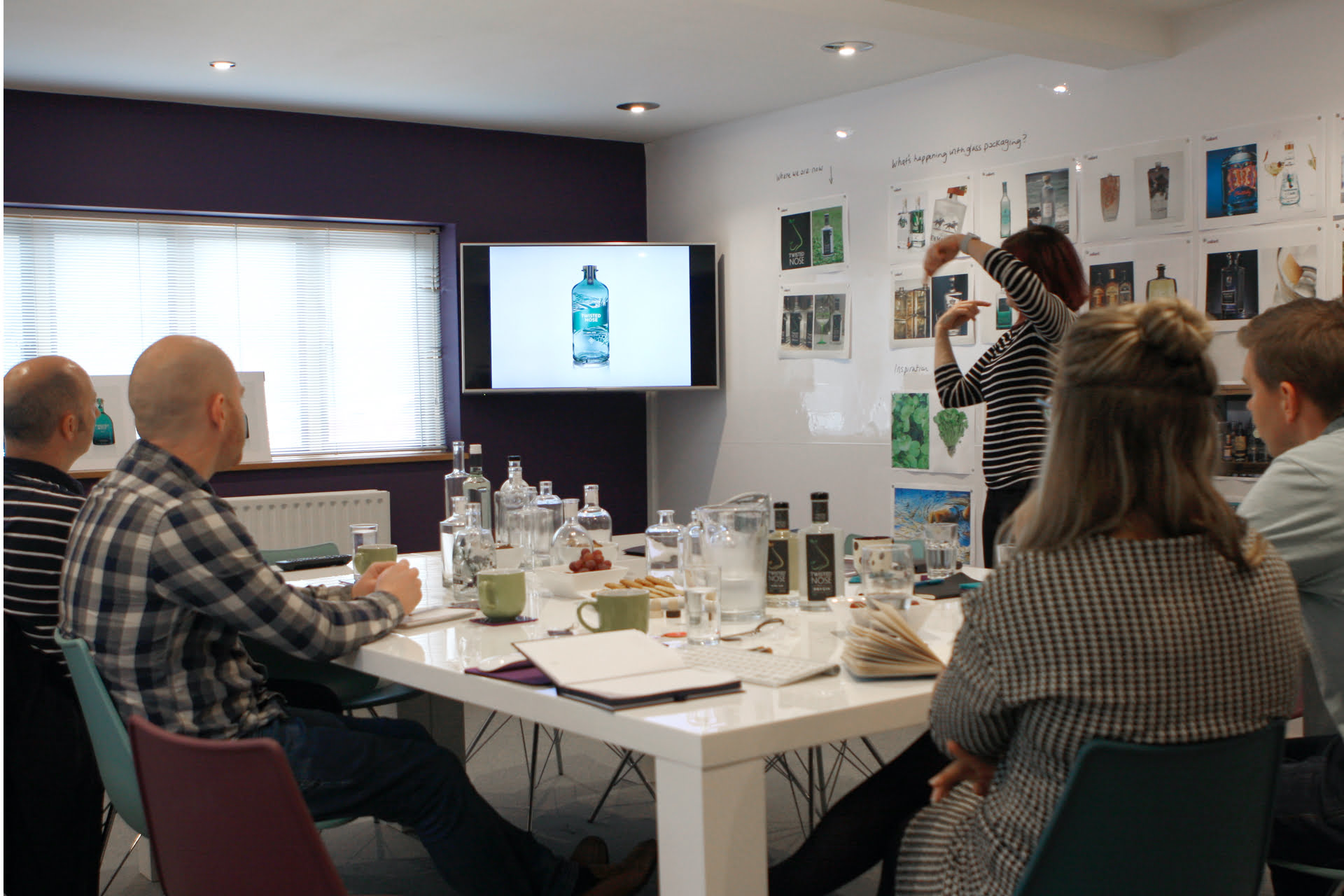
To truly understand the product, the Valiant design team underwent multiple gin tastings — led by the Distillery’s founder Paul Bowler. Yes, another reason why we absolutely love what we do.
Actions
Brand identity
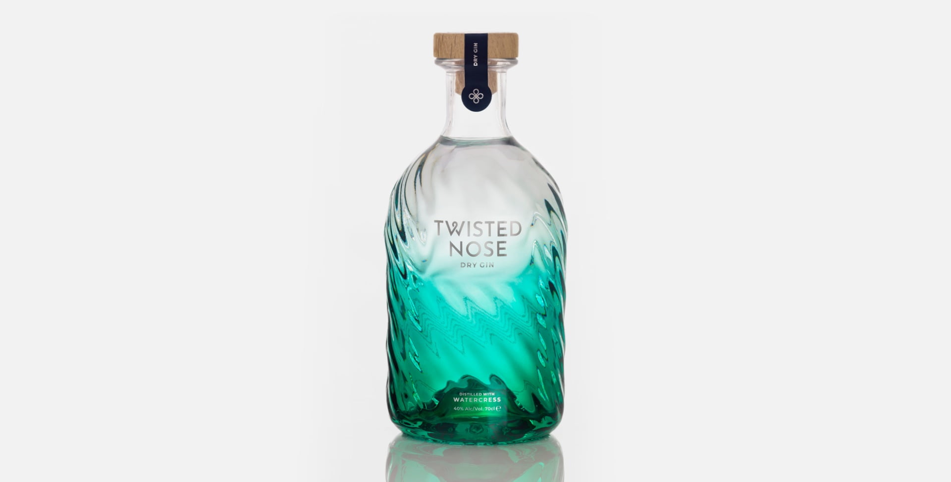
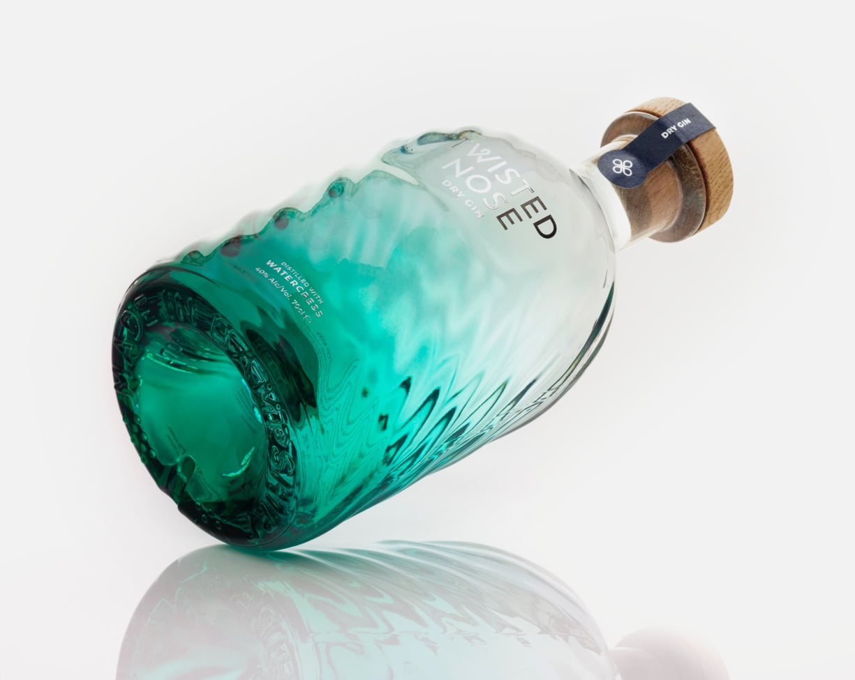
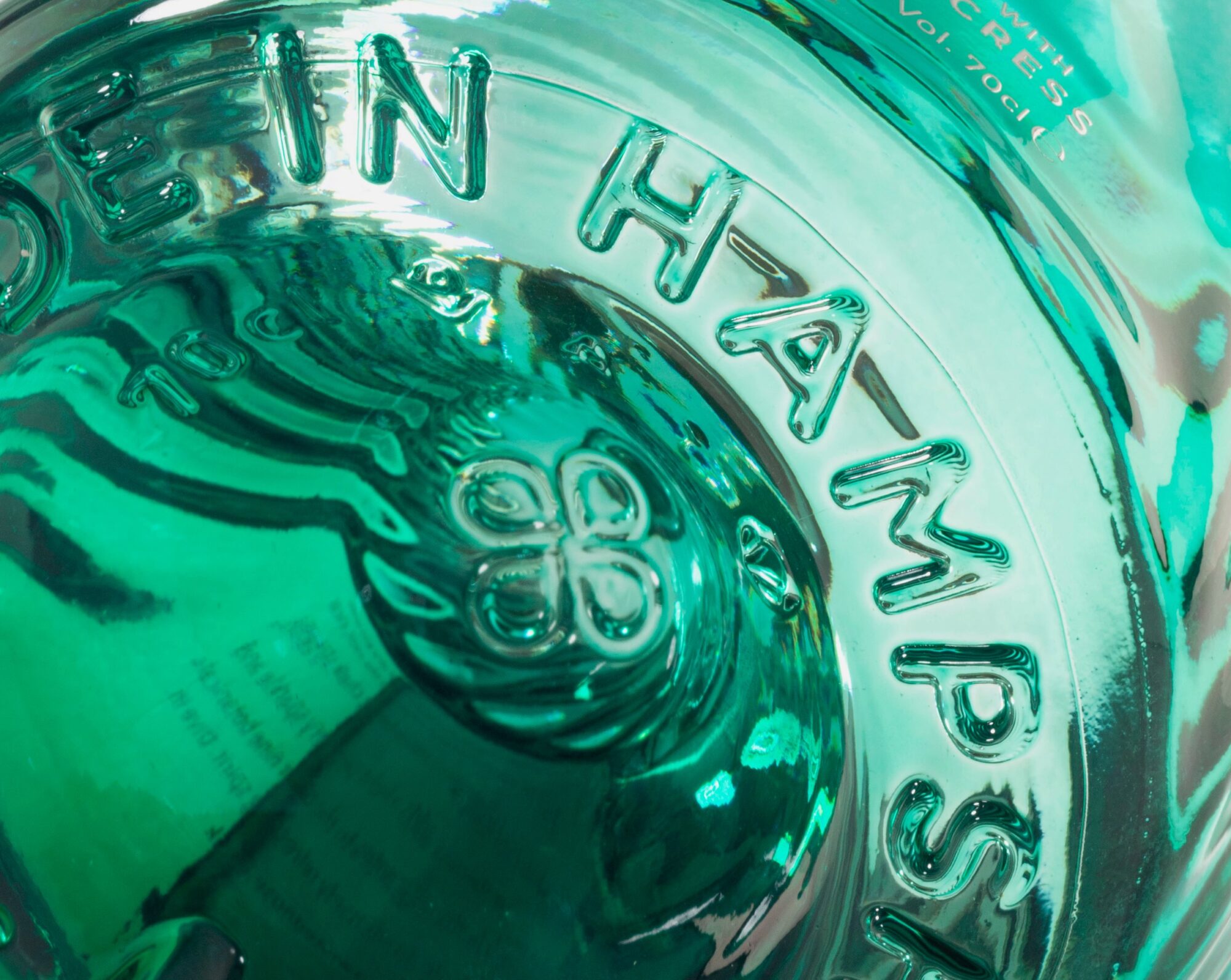
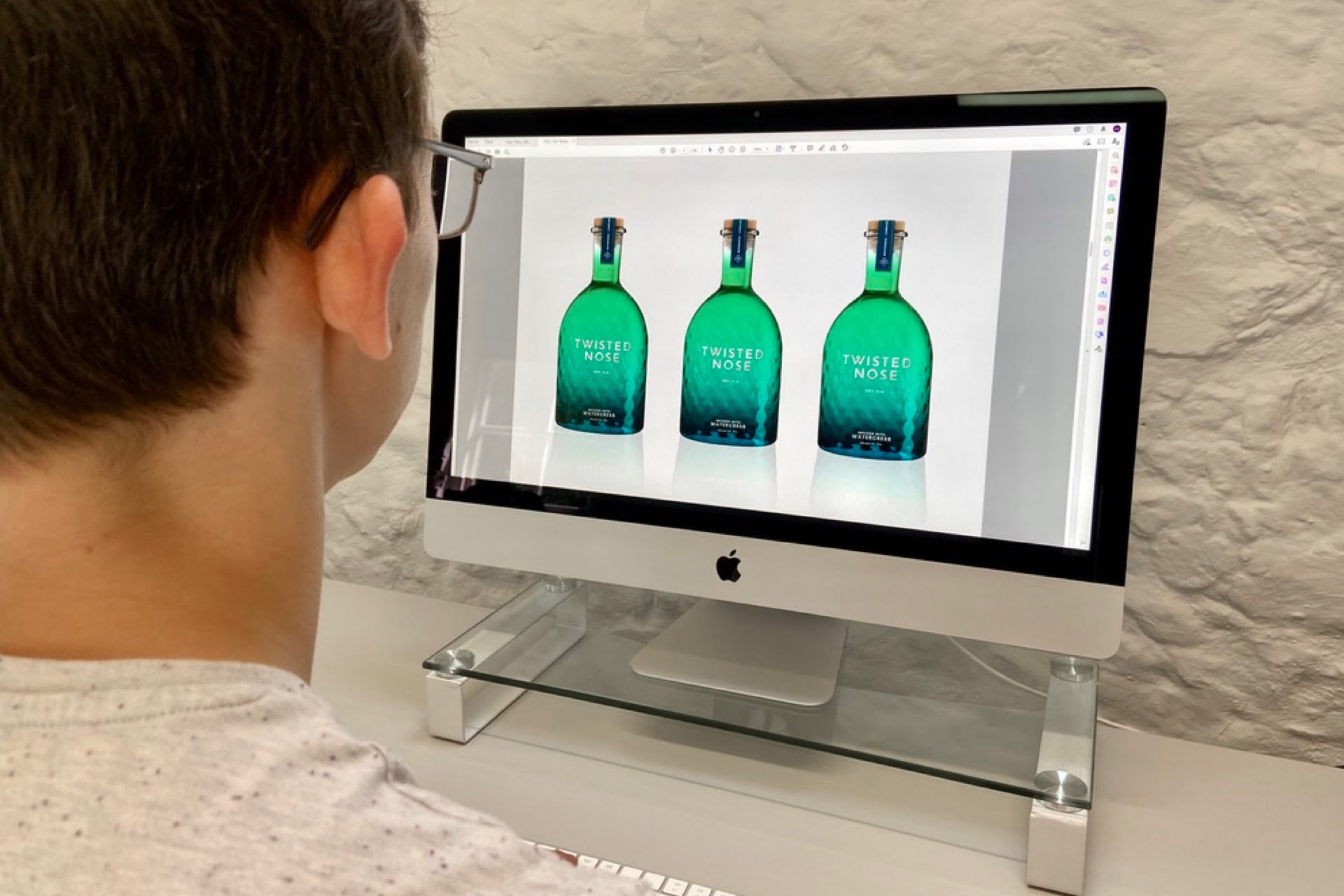
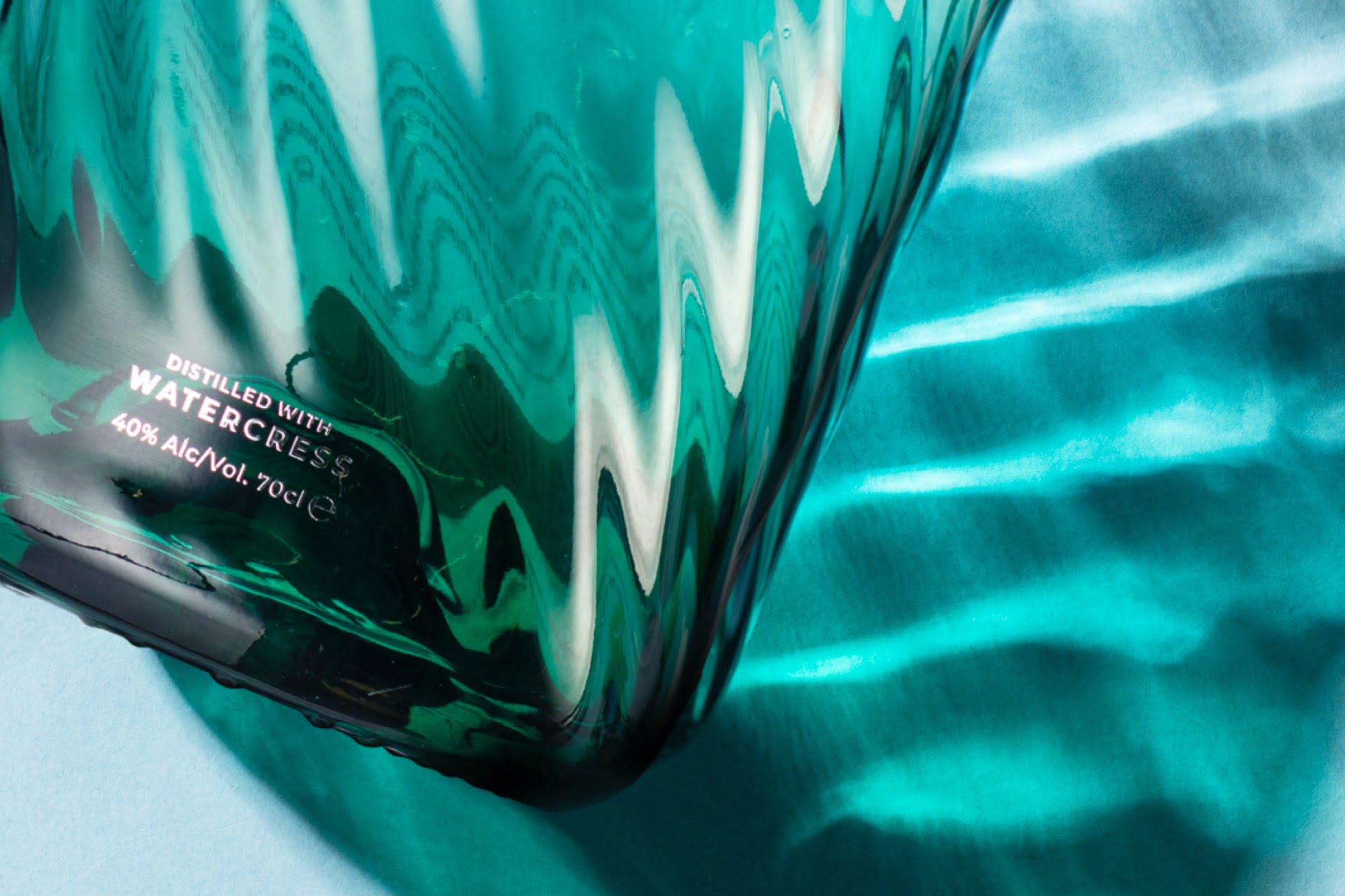
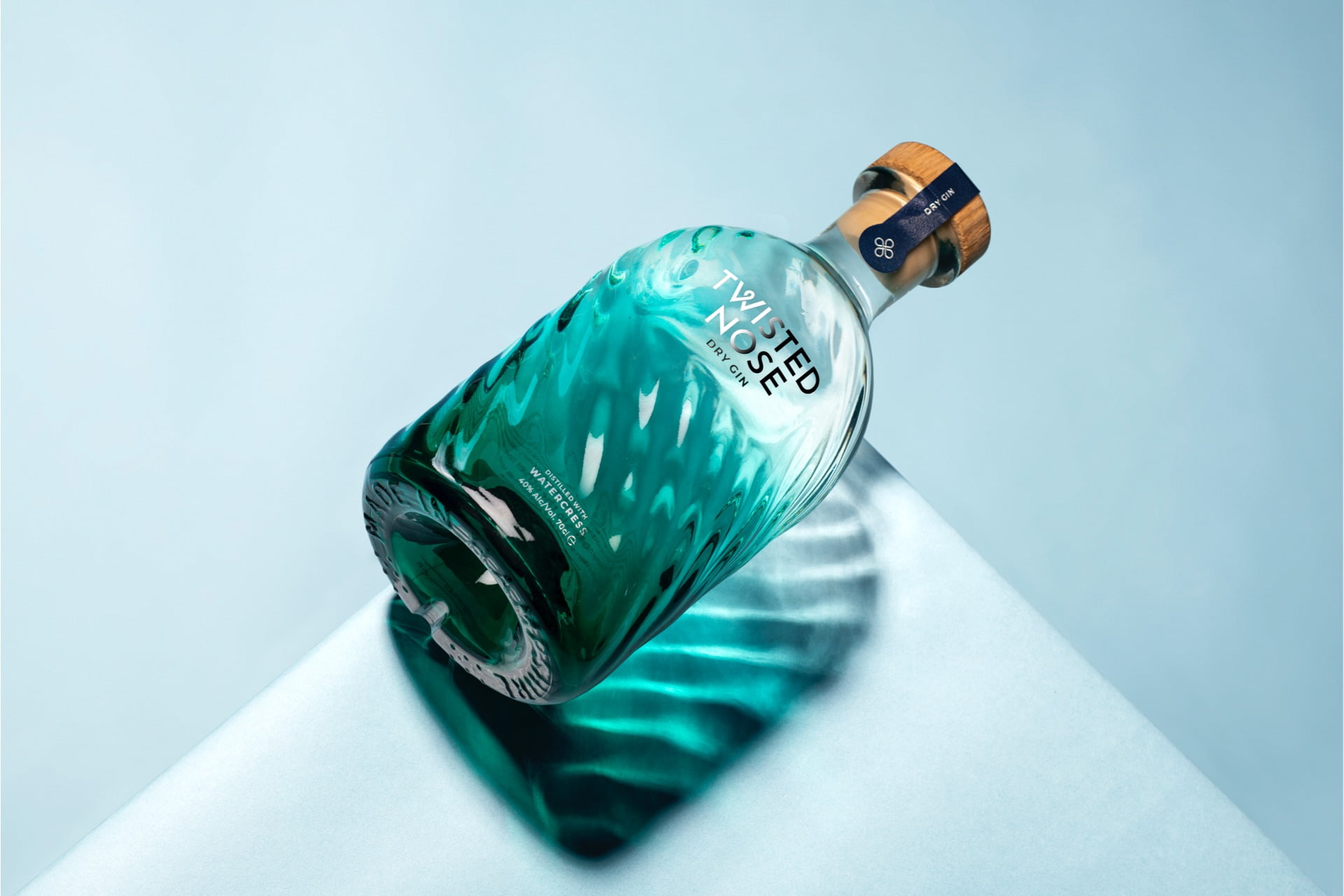
We focused initially on creating the new brand identity — clean, sharp typography for the logo with a twist in the W. This “twist” was developed further to create a graphical representation of the watercress leaves. This symbol is used in silver foil on the tamper seal to match the on-bottle decorating of the logo. When you get to the end of the bottle to pour those final G&Ts (honestly, it won’t take you that long) you’ll notice the base of the bottle with its ‘Made In Hampshire’ provenance and watercress symbol embossed around and inside the punt.
Bottle design and packaging
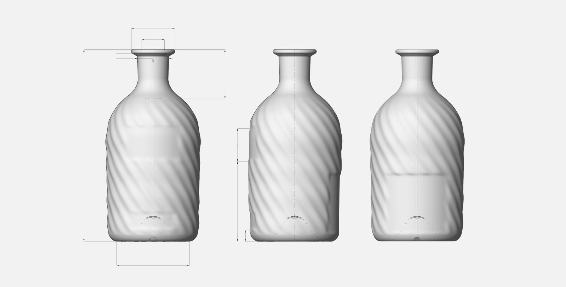
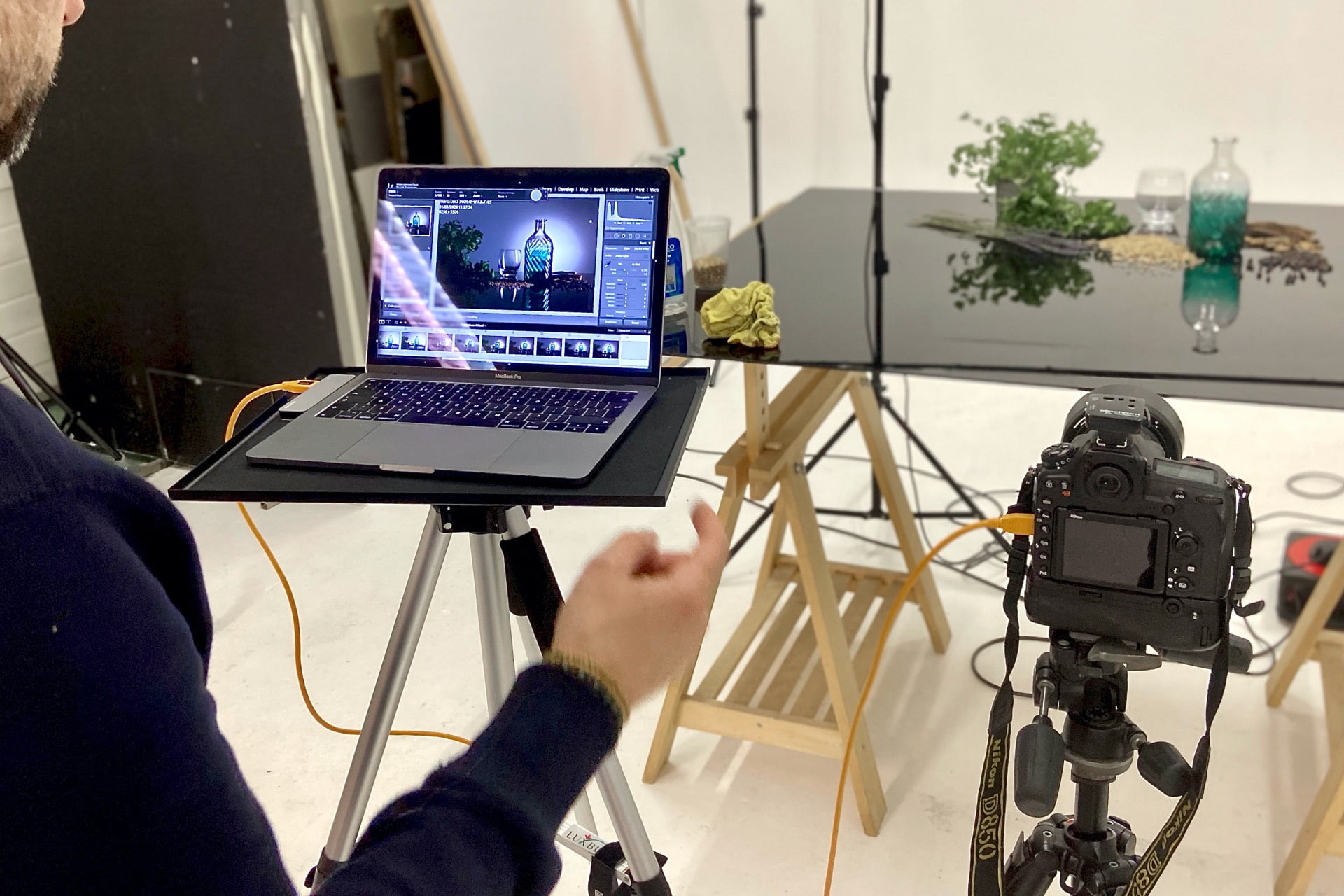
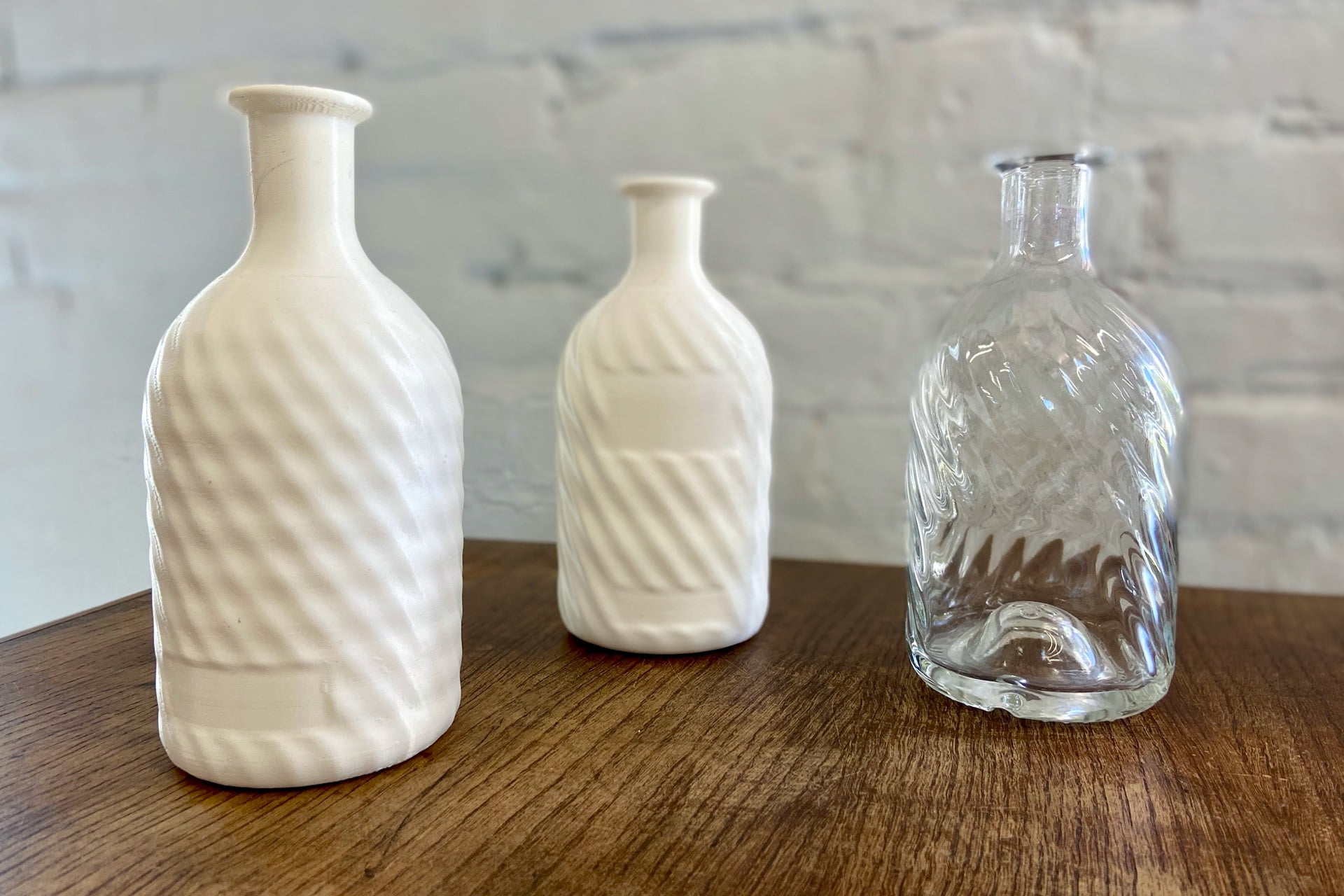
The bottle itself was the result of months of development, pushing the manufacturers to create something truly original. How do you capture the ripples of the chalk stream, the clarity, the sparkle, the green of the watercress; and make it feel beautifully balanced in the hand — all whilst reducing glass usage?
It took sketches, photoshop work, renders with Adobe Dimensions, 3D printed models, prototypes without colour through to each individual decorated finish. We knew we’d captured our vision when we sat a bottle in our studios and the spring sun filtered through the glass. It created a reflection that rippled magically just like the streams nearby. The subtle ripples and colour gently fade out as they reach the neck of the bottle — allowing the clarity of the gin to show at the top of the bottle. The darker, deeper base is redolent of the watercress beds that surround the distillery, whose stems twist and turn towards the surface of the water.
Production
By choosing to apply the branding and description in silver foil we were able to minimise the bottling and packaging process in the distillery — with no additional labelling. The solid oak stopper adds the final quality touch to our new elegant bottle. We’ve also reduced the amount of glass used in the bottle by 20% and significantly reduced any plastic usage too. So all round more efficient process using fewer materials.
The values of the distillery have underpinned every step of the rebranding journey; the provenance, authenticity and heritage of Twisted Nose gin.
Results
Has the new branding and bottle met the initial objectives?
On and off-trade customers are loving it. Dry January – the poorest month of sales for alcohol in the UK – saw a significant uplift on last year. For the first time consumers are buying multiple bottles before even trying the gin itself. Existing loyal fans say their favourite gin is now presented in a bottle that matches its flavour profile and elegance. Distributors, independents and retail buyers are seeing increasing demand even at this early stage, and imagery of the bottle went viral on social media.
And to top it all just a few weeks after launch it went on to win the World’s Best Gin Design award and scored a rare double gold award for design at The San Francisco Spirits Awards. Does it get better than that?
We believe this will continue to raise the profile of the product and introduce more people to the Twisted Nose brand. Cheers to that.
More reading
If you want to find out more about how to increase sales in a saturated market within the drinks industry, have a read of our article here.

Deliverables
- Discover
- Research
- Competitor analysis
- Brand strategy
- Brand positioning
- Web strategy
- Values
- Key messaging
- Employee engagement strategy
- Design
- Naming
- Tone of voice
- Brand development
- Website design
- Marketing communications
- Launch campaign
- Launch materials
- Packaging
- Prototypes
- Develop
- Brand guidelines
- Brand application
- Website
- Deliver
- Animations
- Brand guidelines
- Brand application
- Website
- E-marketing
- Sales proposals
- Marketing communications
- Industry report
- Employee engagement
- Social media
- Photography
- Video
