Brand strategy and positioning
We never make assumptions. Even though we’ve worked with Inalytics for years, we entered the project with fresh eyes and open minds. We began the Discovery process by researching and reviewing both the competitor landscape and Inalytics’ perceived position within the industry. This insight was then used in workshops and brainstorms to help establish what the core of the new messaging and approach should be. The recurring theme of innovation and technology gave us a powerful story to tell at the next stage. We were able to distil the best of what was relevant in the existing branding and give it an entirely new and inspiring context.
Brand design
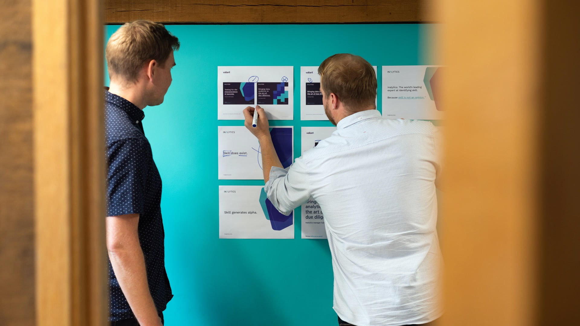
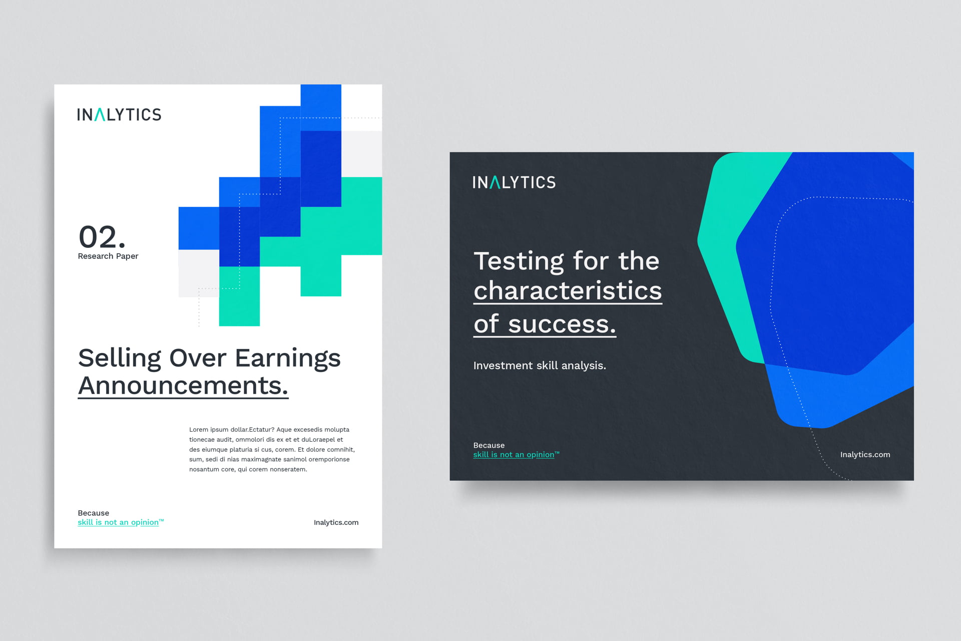
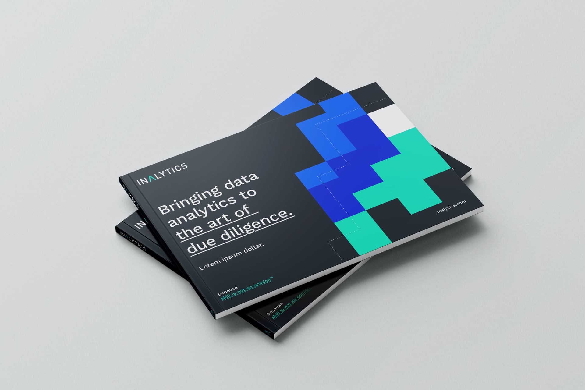
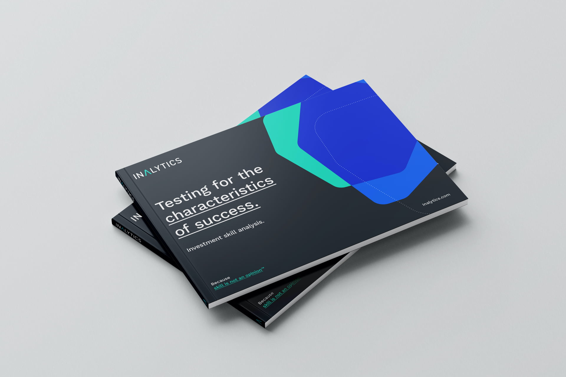
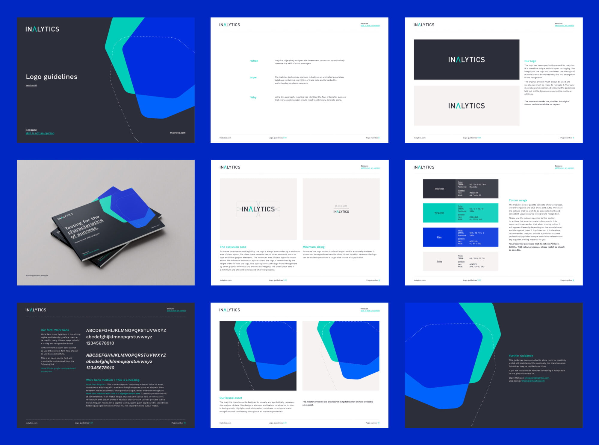
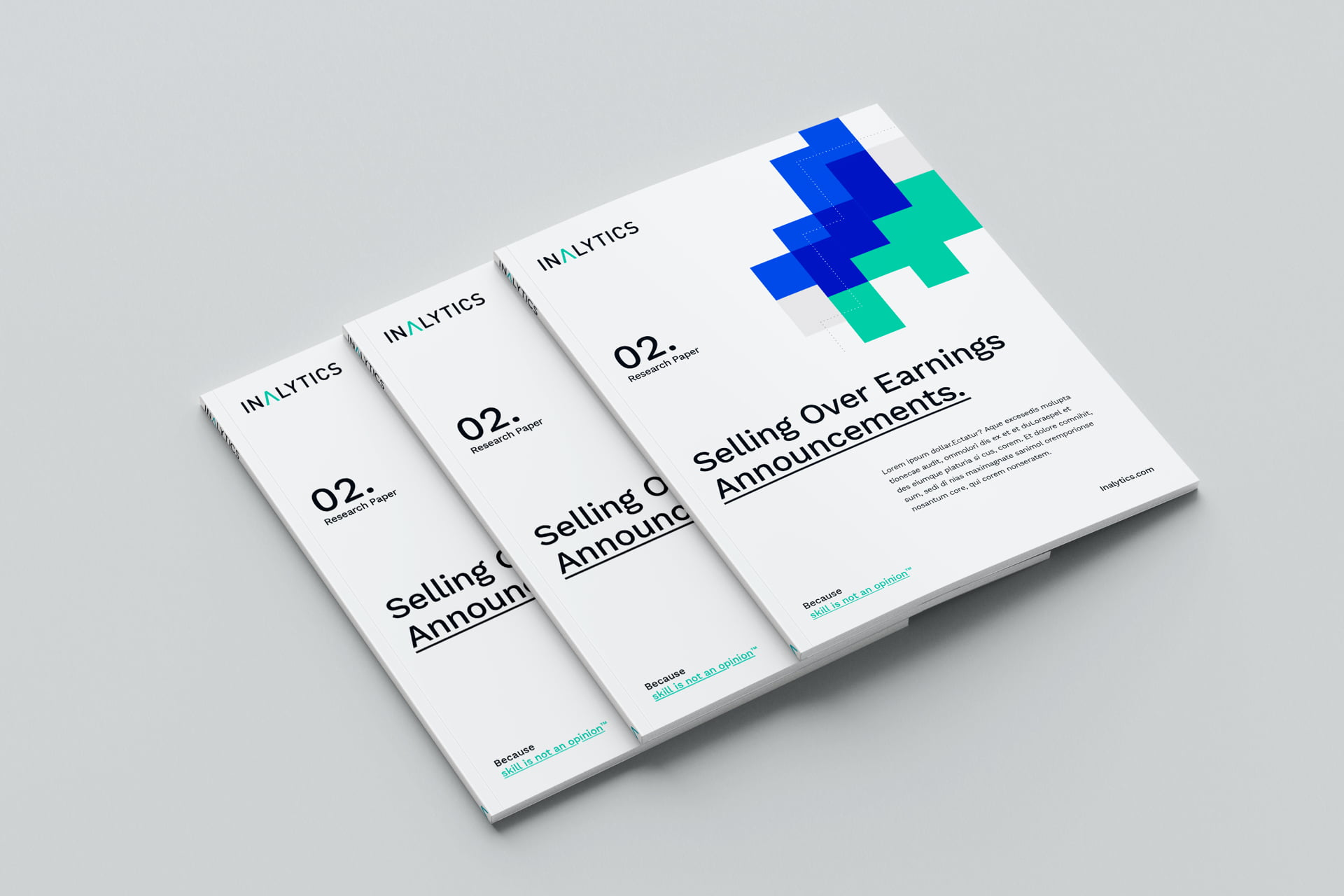
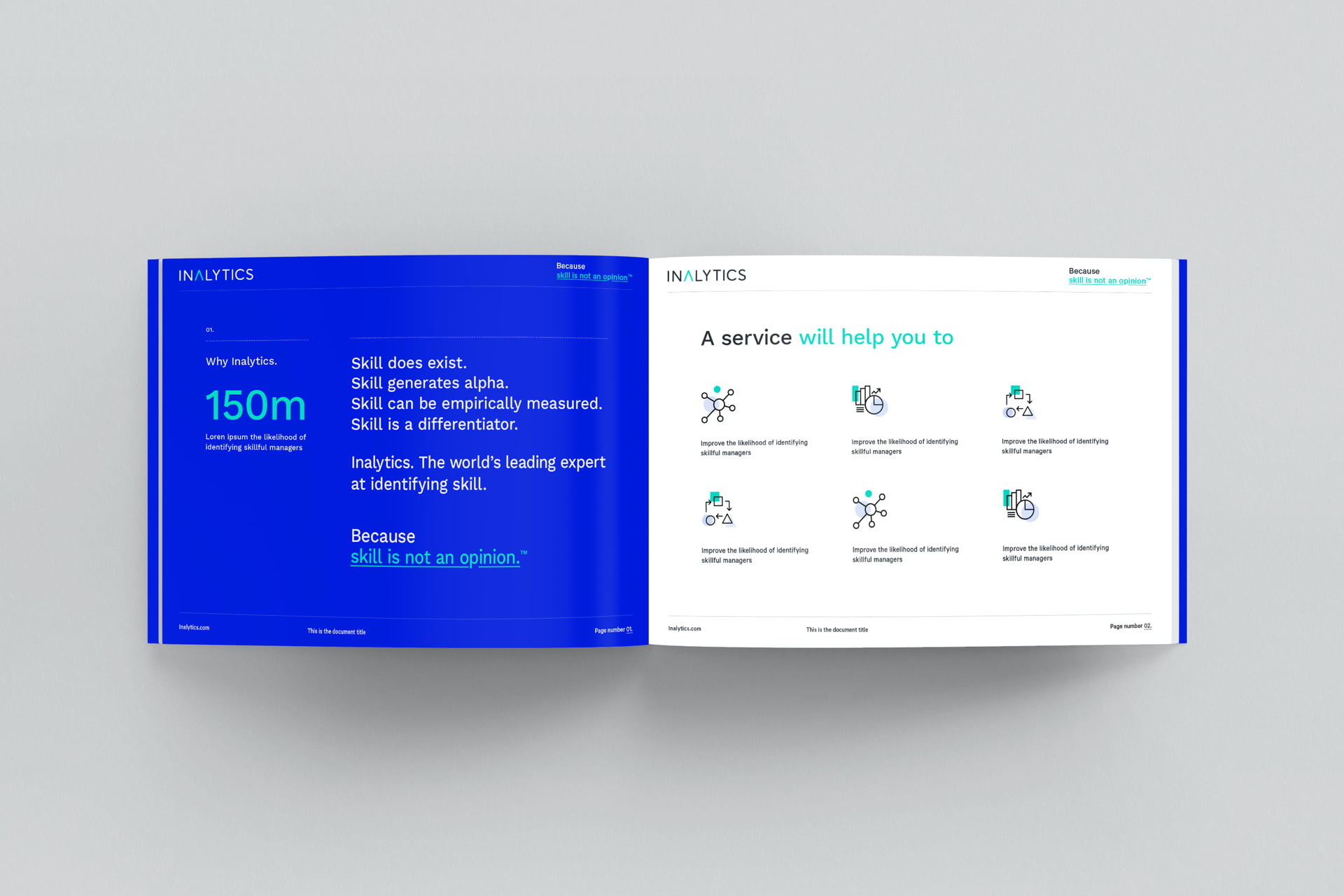
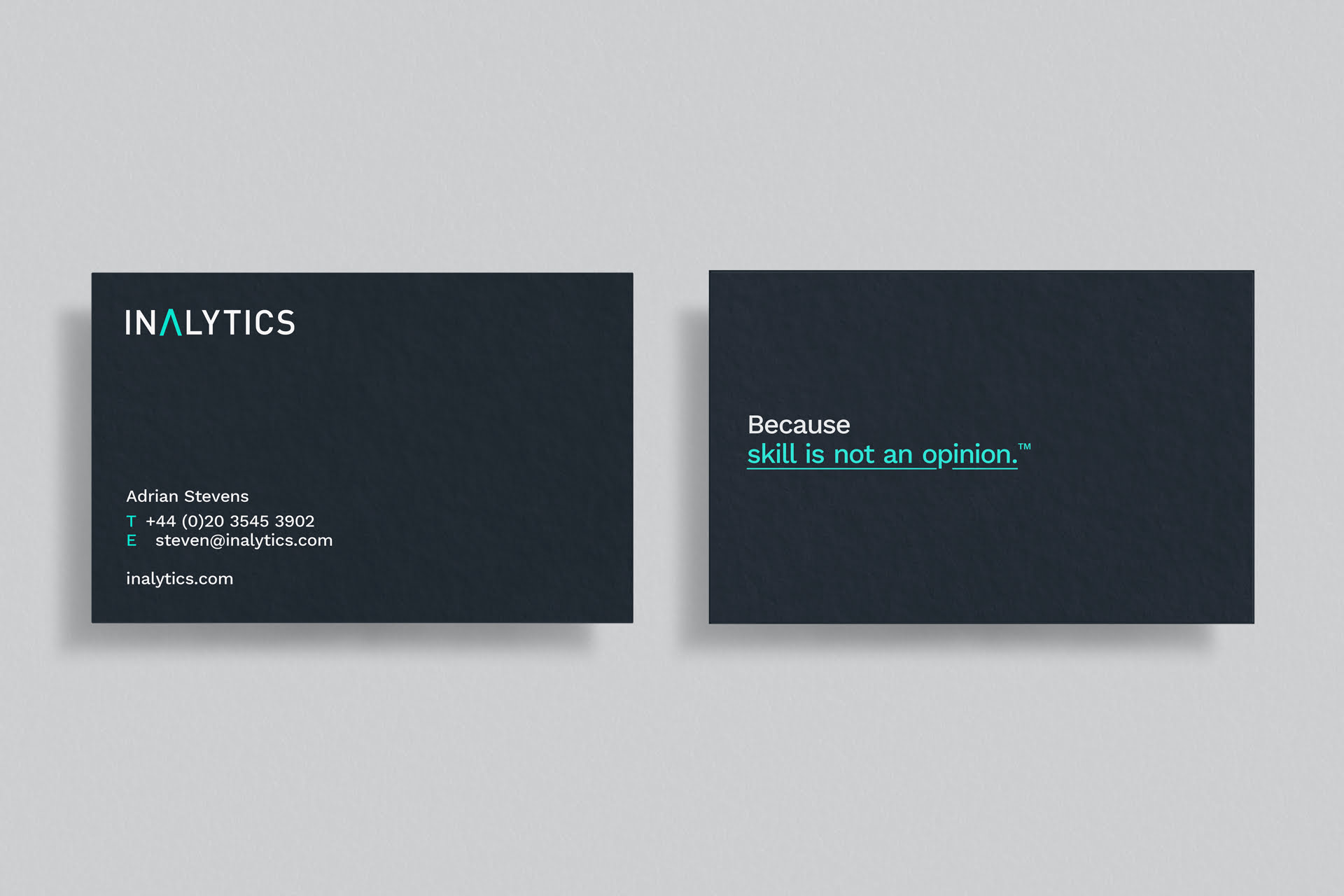
A new visual identity and colour palette came together that was vibrant and energetic, while remaining totally recognisable as Inalytics. Supporting assets were inspired by visual data modelling, producing simple, colourful, abstract shapes. The design communicated the complexity and accuracy of the data they represented. Once agreed, we rolled out the new identity across a wide range of collateral, from marketing brochures, reports, presentations and research papers.
New WordPress website
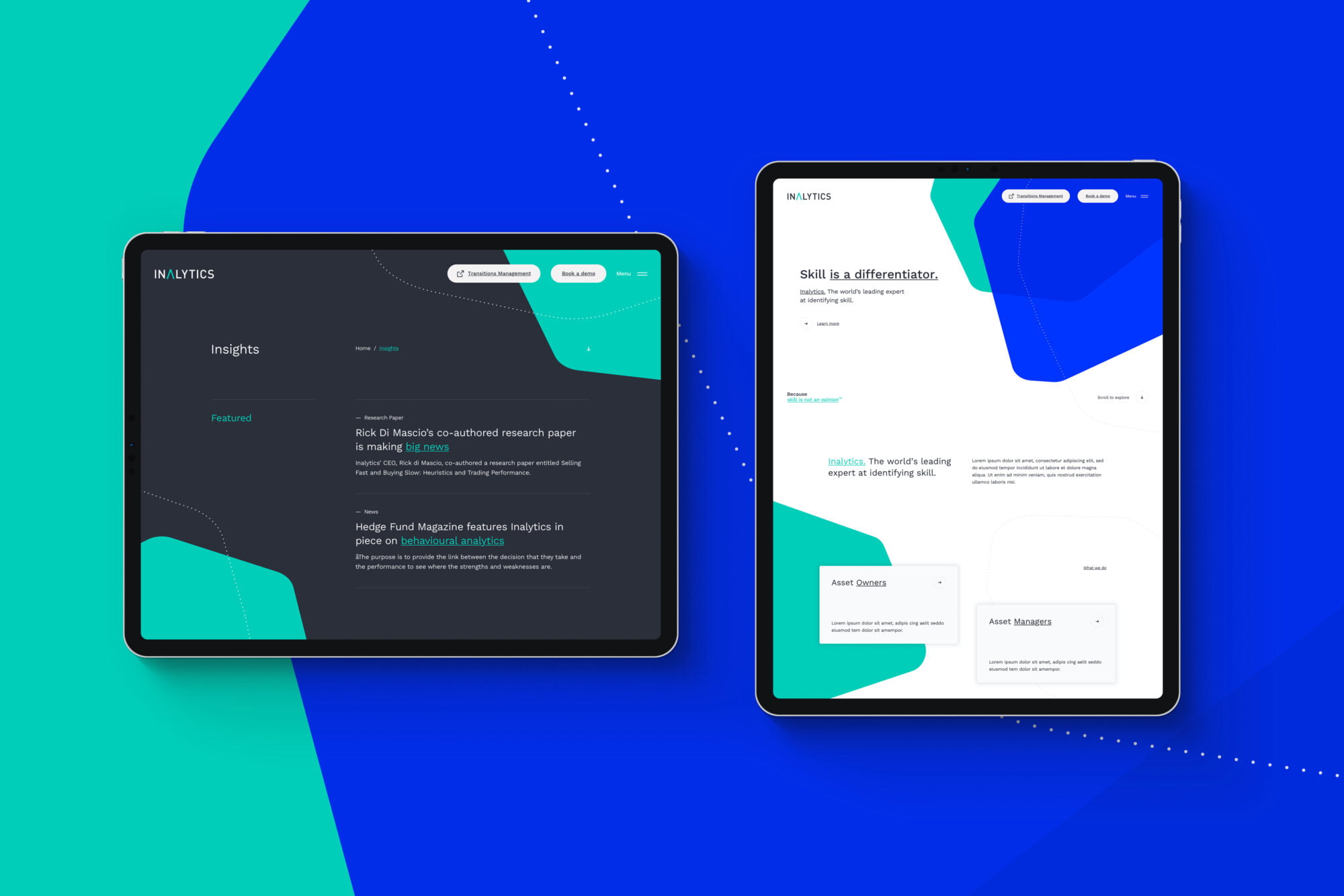
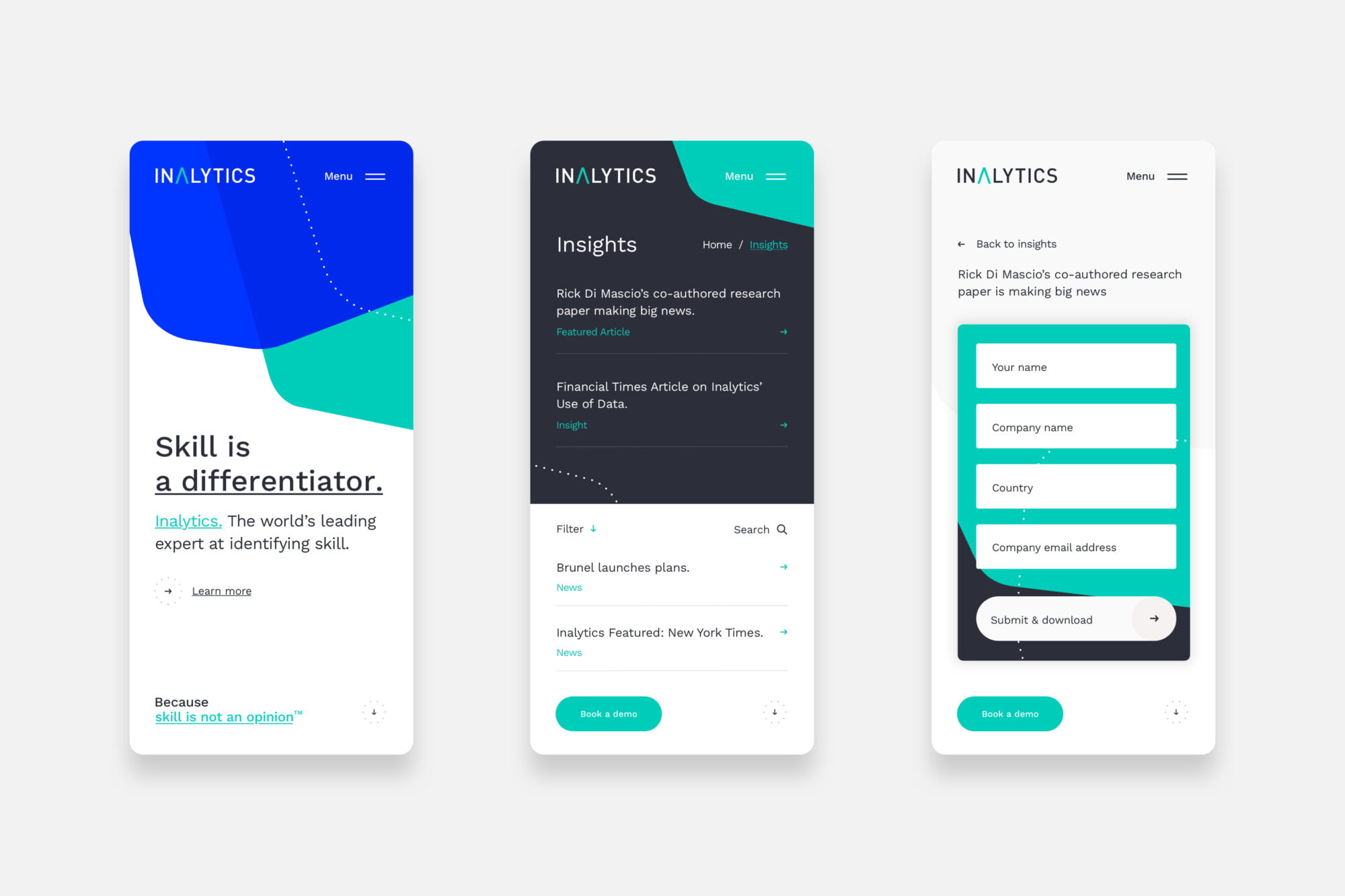
The rebuild of the website gave us a fantastic opportunity to infuse the new identity with movement and interaction. We built the secure and optimised site using a fully bespoke WordPress development. A super easy content management system along with a fully flexible approach makes this a preferred choice for many clients. We created a confident and arresting design using imagery inspired by the data projections. These brand assets morph, emerge and change as a user scrolls. This engages and invites the user to explore and discover. The website really is the ultimate representation of Inalytics’ own position – a powerfully simple end result, built on complex, cutting edge technology.
